The Art of Color Matching between Wallpaper and Furniture
In the vast world of home decoration, color is the stroke of the soul. It not only defines the atmosphere of the space, but also profoundly affects the emotions and psychology of the occupants. Wallpaper and furniture are important components of home decoration, and the artistic color matching is particularly crucial. Today, let's explore together how to cleverly integrate the colors of wallpaper and furniture. With the rich product line directly sold by the original wallpaper manufacturer (address: 2nd floor, Gate 91, Zone 4, Yiwu International Trade City), we aim to create a harmonious and personalized home environment.
1、 Understanding the basics of color and laying the foundation for matching
Before matching wallpaper and furniture colors, it is necessary to have an understanding of the basic principles of color. Colors can be divided into two categories: cool tones and warm tones. The former, such as blue and green, gives people a sense of tranquility and freshness; The latter, such as red and orange, brings a warm and vibrant atmosphere. In addition, colors also have variations in brightness and purity, which together constitute infinite possibilities for color matching.
2、 Color contrast and coordination create a sense of hierarchy
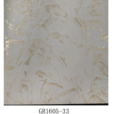
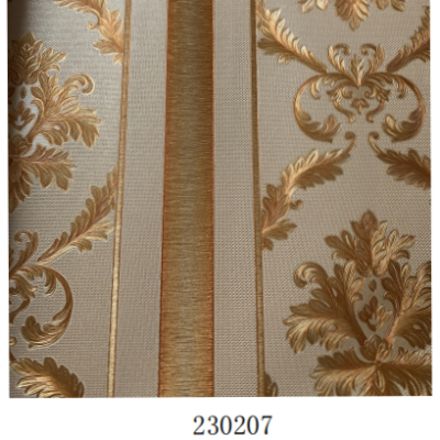
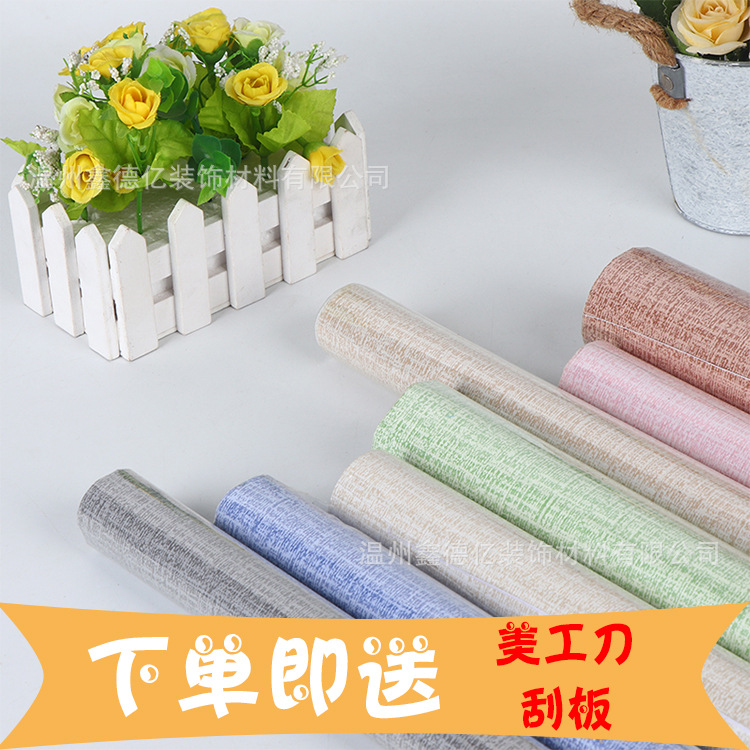
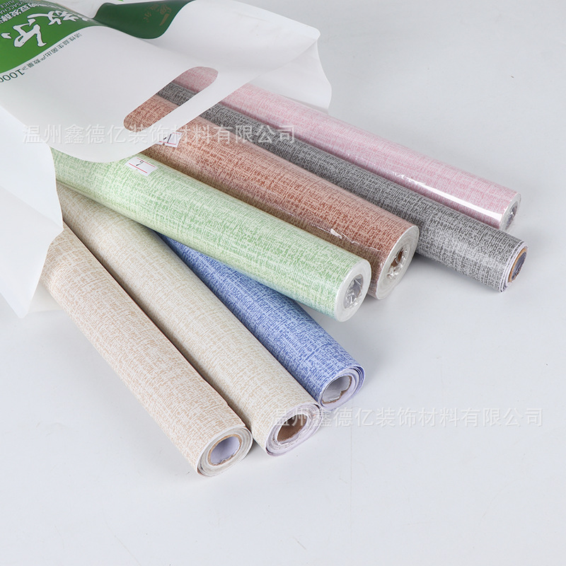
1. Contrastive matching: By utilizing strong color contrasts, vivid and lively spatial effects can be created. For example, choosing dark toned wallpaper as the background and pairing it with light or bright colored furniture can attract attention and form a visual focus through the strong contrast of colors. The diverse patterns and color choices provided by the original wallpaper are the ideal materials to achieve this effect.
2. Coordinated matching: For families who pursue a warm and harmonious atmosphere, they can choose wallpaper and furniture with similar colors or the same color scheme for matching. This combination can create a peaceful and comfortable living environment, making the space appear more spacious and bright. The soft tones and warm texture of the original wallpaper are very suitable for creating this style.
3、 Consider spatial functionality and personal preferences
Different home spaces have their own unique functional needs and emotional expressions. For example, the bedroom is a place for rest and relaxation, suitable for using soft and peaceful color combinations; As the center of family activities, the living room can choose brighter and more lively color combinations. At the same time, personal aesthetic preferences are also an important factor that cannot be ignored. Only color combinations that truly meet the preferences of residents can create a satisfactory home environment.
4、 Details determine success or failure, emphasizing the harmony between the whole and the parts
In the color matching of wallpaper and furniture, attention to detail is equally important. In addition to large furniture items, it is also important to pay attention to the color selection of soft furnishings such as curtains, carpets, and hanging paintings, ensuring that they complement wallpaper and furniture in color and create a cohesive visual effect. Chupai Wallpaper not only provides high-quality wallpaper products, but also offers one-stop home matching suggestions based on customer needs, helping to create a perfect home space.
5、 Conclusion
The color matching of wallpaper and furniture is a scientific and artistic discipline that requires us to comprehensively consider various factors such as spatial functionality, personal preferences, and detail processing based on our understanding of color principles. The initial wallpaper manufacturer's direct sales, with its rich product line, high-quality products, and professional matching suggestions, provide a solid backing for consumers to realize their dreams of home decoration. On the second floor of Gate 91 in Zone 4 of Yiwu International Trade City, we look forward to embarking on a wonderful journey of home color with you.